Home
Economic Issues
As of: March 8,
2023
Articles and comments on economic issues.
US
Federal Spending Pie Chart
December 28, 2022:
The monthly supply of new houses in the United States (MSACSR) is a statistic published by the St. Louis
Federal Reserve Bank. MSACSR is the ratio of new homes for sale to
new houses sold, and shows how long the current inventory would last if no
new homes were built.
MSACSR is a fairly reliable leading indicator of recessions; note the
shaded areas for the recessions of 1975, 1980, and 2008. A value of
6 is considered by some to be a "balanced" condition. The curve
shows a rapid increase in available homes since December, 2021, a likely
indicator that the U.S. economy is heading into, or is already in, a
recession.
The data is updated monthly, but lags by one month;
-
The value for May, 2022 was 8.3.
-
The value for June 2022 was 9.4.
-
The value for July, 2022 was 10.1
-
The value for August, 2022 was 8.5
-
The value for September, 2022 was 9.9
-
The value for October is 9.3
-
The value for November, 2022 is 8.6 (as of December 27, 2022).
-
The value for January, 2023 is 7.9 (as of February 24, 2023)
Since 1963, any time the MSACSR number reached 9.5 or greater, there was
an associated recession.
Also interesting is very rapid drop that began in April 2020. By
August, 2020 the MSACSR had dropped to 3.3, the lowest it has ever been
(since 1963).
The previous low was 3.5 in the summer of 2003. Then we see a
steady run-up in supply, reaching 10.9 in September 2008 and peaking at
12.2 in January, 2009. So, before the 2007-2008 recession, it took 5
years to go from 3.5 to 10.9.
By contrast, in our current bubble, it has taken only 2 years to go from
3.3 to 10.1.
December 28, 2022
Most economists
will tell you, there may be no sign of a pending recession more reliable
than the inversion of the yield curve. The yield curve refers to a graph
of the interest rates on Treasury bonds (government debt) of varying
lengths. Money lent for longer periods of time normally has a higher
rate to reflect the increased risk, so the numbers usually slope from
lower rates for the short-term debt to higher rates for the long-term
debt.
However, the
value of long-term bonds increases significantly when either interest
rates or the stock markets drop, and because both those things happen
simultaneously during a recession, bond traders start scrambling for the
long-term debt when they feel a downturn is looming. That increased
demand can eventually push the interest rates on long-term debt below
short-term debt — “inverting” the yield curve.
Compare of the
"spread" between the rates on 30-year and 10-year Treasury bonds.
The formula is: spread = 30-year-rate minus 10-year-rate.
The closer this number gets to zero, the more nervous investors
are. Going into negative numbers (less than zero) is a clear
indication of lack of investor confidence.
On September 20,
2021, the spread was 0.54. The curve went briefly negative on June
13-14, 2022. The current value (December 2, 2022) is
0.05%.
There is a
similar yield curve for the 10-year versus 2-year bonds
That curve went briefly negative about April 1, 2022, and it has been
negative since July 6, 2022. As of December 2, 2022, the 10-2
spread is -0.77, the lowest since July 1, 2022.
A negative 10-2
spread has predicted every recession from 1955 to 2018, but has occurred
6-24 months before the recession, and is thus seen as a far-leading
indicator.
Finally, look at the spread for the 3-month versus the 10 year.
This had declined to -.83.
See the link below for a graph of the bond spreads since July 1, 2022
January 25, 2023
An interesting
statistic is the ratio between the average US home price, and the median
household income. Historically, the average American house cost
about 5 times the average yearly household income. In the housing
bubble of 2005-2007, the ratio peaked at 7 in December, 2005.
However, on March
31, 2022, the ratio was 8.04, the highest it has ever been. As of
April 30, the ratio has increased to 8.13. This would seem to be a
significant indication that we are in a housing "bubble" and a
correction is on the way, if it has not already started. Examine the data and draw your own conclusions.
For June, 2022,
the ratio has dropped to 7.07, based on a average home price of
$550,775, and a median income of $77,881.
Average
Sales Price of Houses Sold in the United States
Median
Household Income
August 1, 2022
The Atlanta
Federal Reserve has an "unofficial" Gross Domestic Product (GDP)
forecast model known as GDPNow. The 2022-Q1 GDP was down by
1.6%. GDPNow is currently predicting that the 2022-Q2 GDP will be
down by 1.6%. The GDPNow model is updated weekly.
The Bureau of
Economic Analysis (BEA), an agency of the US Department of Commerce,
also produces a GDP analysis.
As of July 28, 2022 it showed the following data:
-
Q1-2022: -1.6%
-
Q2-2022: -0.9%
If this data does
not change significantly, it will mean two consecutive quarters of
negative GDP growth. This is a commonly accepted definition of the
US economy entering a recession.
September 22,
2022
Remember the "Misery Index"?
It is the sum of the U.S. inflation rate and the unemployment
rate. It was at its highest in 1980, when it reached 21.98%.
Before the reaction to COVID-19, the index was at 5.939% (March,
2020). It peaked at 15.03% in April, 2020, and declined to 8.062%
by December, 2020. There has been a gradual increase since
then. In May, 2022, the index was at 12.18%. June saw the
index increase to 12.66% (9.1% plus 3.6%). It decreased to 12.56% in
July, 2022.
Data on the inflation rate. (Drill down to 20-year
chart)
-
In June,
2022, the Consumer Price Index rose 1.3% (seasonally adjusted), and
rose 9.1% (not seasonally adjusted) over the last 12 months.
This was the largest 12-month increase since November 1981.
-
In July,
2022, the CPI was 8.5%
-
In August,
2022 the CPI was 8.3%
-
In June, 2022 the unemployment rate was 3.6%
-
In July, 2022 the unemployment rate was 3.5%
-
In August, 2022, the unemployment rate was 3.7%
August 4, 2022
When discussing the overall US economic situation, the Biden
administration has been pointing out the low unemployment rate (3.6% in
June, 2022) and the increasing number of job openings. However, in
June, 2022 the Bureau of Labor Statistics (BLS), in their JOLTS report
(Job Openings and Labor Turnover) reported that total job openings
decreased over 600,000 in June, 2022, the third largest drop on
record. JOLTS non-farm data.
- The largest decreases in job openings were:
- Retail Trade: lost 343,000
- Wholesale Trade: lost 82,000
- State and Local Government Education: lost 62,000
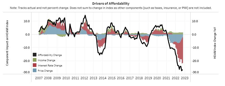
January 15, 2023
The Atlanta Fed produces considerable
information about home affordability. Here are two interesting
graphs that can be found at the Atlanta Fed website.
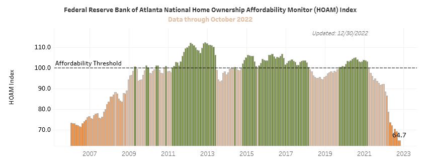
Note the following:
- The HOAM affordability index for June, 2022 was at the lowest point
(67.5) that it has ever been, since 2006.
- The previous low was 71.5 in July, 2006, during the last housing
bubble.
- The data shown here is through July, 2022, and last updated on
September 20, 2022
- The Affordability Index began a steep plunge in January, 2021, the
same time the Biden administration came into office.
- On September 21, 2022 the Fed announced a further 0.75% increase in
the benchmark rate. This will increase mortgage rates and cause
the HOAM to drop further.
- The HOAM index for August, 2022 declined further from 70.2 to
69.3. 30-year fixed mortgage rate is 6.65% as of November 14, 2022
- AS of December 30, 2023, the HOAM index has declined to 64.7.
This is the lowest since 2006.
September 27, 2022
A lot of good information on mortgages and
related topics can be found at Mortgage News Daily.
On September 27, 2022 the reported average
for a 30-year fixed mortgage is 6.87%.
On September 28, 2022 the reported average
for a 30-year fixed mortgage is 7.08%.
i